The Rule of Thirds
When composing your photographs, this tip is tops
By Marion Owen, Fearless Weeder
for PlanTea, Inc. and
Co-author of Chicken Soup for the Gardener's Soul
FEATURE ARTICLE:

Tom Hanks' "Power of Four" solution
More good stuff:
Who is Marion Owen?
FAQs about PlanTea
Search Marion's articles, tips and recipes
Why grow organic?
News and press releases
Read love letters
How to link to this site
Need a speaker?
How to contact Marion
Visiting Alaska?
Come to Kodiak Island!
Go to home page

Marion's UpBeet Gardener
Newsletter has been
replaced by Marion's blog
which you can find at:
www.marionowen.wordpress.com
When taking a picture, we tend to follow two basic steps. First, we look through the viewfinder. Second,we push the button. The first step, where most of the creativity comes in, determines whether your pictures are suitable for framing or better off stuffed in a box, forever. To have more "keepers" to show your family and friends, try applying one of the simplest, yet most powerful composition tips, the rule of thirds.
Let's start by looking at two examples. While strolling around your garden you're drawn to this yellow crocus blooming in front of purple crocuses.


The left photo shows a typical shot, placing the subject--the yellow flower--right in the center of the frame. The result is a static picture, where the rest of the photo doesn't provide much in the way of support. It's what I call a "one-looker" because you only want to look at it once! Not really, but you get what I mean.
The photo on the right is much more pleasing to look at. That's because the photographer (you, right?) applied the rule of thirds, making it much more dymanic. Let's explore how to use the rule of thirds and how it can improve your picture taking skills.
The rule of thirds explained
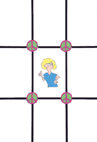
If you don't know where to place your subject within the frame, start with the old standby "rule of thirds." Divide up your image into thirds vertically and horizontally, so it looks like a a tic-tac-toe grid, like the one shown below. The grid is a stong compositional tool: Where the lines intersect are powerful points for placing the subject, or the subject's most important elements. Generally speaking, you don't want to put the main subject in the middle.

Avoid center-weighted photographs. Place your subject
where the lines intersect for a more powerful composition.
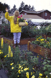
Now let's look at two real-life examples showing how the rules of thirds works in a composition.


In the left photograph, nursery owner Caroline, waves from the upper left hand corner of the photo. At right, the horizon line is place near the top, instead of cutting the image in half across the middle.
|
- - -
- - - - - - - - - - - - - - - - - |
The rule of thirds is a simple and effective way to turn a so-so image
into an award-winning zinger. And once you start putting it into practice,
you'll begin noticing it being used in paintings, billboards, cereal boxes
and TV ads. The rule of thirds may turn out to be the most powerful tool
in your camera bag of tricks. Happy picture taking!
Thanks for visiting and please stop by again. I'll put the coffee on!
Meet Marion Owen /// Learn about PlanTea /// Online Catalog /// Articles, Tips, Recipes /// Get free UpBeet Gardener newsletter /// Read current issue /// Listen to radio show /// Read news and press releases /// More resources and links /// Learn why 'grow organic?' /// View guidelines for retailers /// Read love letters /// Book Marion as a speaker /// Site map /// How to link to us /// Contact us /// Go to home page
PlanTea: The organic plant food in tea bags. http://www.plantea.com
Copyright ©1996 to present: PlanTea, Inc. All Rights Reserved. PO Box 1980, Kodiak, AK 99615-1980 USA
Questions or comments? marion@plantea.com Phone: Toll Free: 1-800-253-6331 (US and Canada); 907-486-2500
